

Births in Germany and Scandinavia (and Slovakia)
Genesis 40:17

This post is too long for e-mail because of its many beautiful diagrams.
Digging into a field of scientific research can be unpleasant. After a while, you notice that the dirt is piling up, and that the treasures are scarce. Take population research, particularly research on fertility, which is a pastime and simulacrum of science for us filthy rich Westerners. We do not procreate but alliterate. Poor People do not Produce Population Papers, Poor People Produce Population.
For example, we Germans can afford at least two institutes dedicated to population research: the Bundesinstitut für Bevölkerungsforschung (BiB) in Wiesbaden, and the Max Planck Institut für Demografische Forschung (MPIDR) in Rostock.
From the BiB, we learn about “Fertility declines near the end of the COVID-19 pandemic”. Bujard and his Swedish colleague Andersson study “the unexpected birth decline in 2022 in Germany and Sweden”. After having examined monthly data on births in detail, they conclude that “there is no association of the fertility trends with changes in unemployment, infection rates, or COVID-19 deaths” but that “there is a strong association between the onset of vaccination programmes and the fertility decline nine months after this onset”. And then they ruin it with narrative icing on their statistical cake: “The association between the onset of mass vaccinations and subsequent fertility decline indicates that people adjusted their behaviour to get vaccinated before becoming pregnant.” The peer-reviewed version appeared in 2024, with no changes to this hilarious proposition, and no comment on the even worse situation in 2023 when everybody had had the chance to wade knee-deep in boosters.
But at least there is some cake beneath, which is not the case for your typical MPIDR paper. The ladies over there go “beyond the continuum”, and offer “a micro-level analysis of the gender equality-fertility nexus in three Nordic countries”. Basically, they juggle with the jargon of the “fertility research community” (excellent stuff like the “second demographic transition (SDT) paradigm”, and “fertility-equality reversal theories” - let’s call them FERTs, shall we?), and then they quickly withdraw from the hard data that can be observed in the world, and study what people say. Let me tell you something: people will say all kinds of things in surveys, and “the 2020-2022 data collection of the Generations and Gender Surveys (GGS II) in Denmark, Finland, and Norway” is no exception. You may “include parenthood as a life goal and satisfaction with household work as predictors of fertility intentions” all day long, and yet what happened in 2021, 2022, and 2023 will take you by surprise. Good grief, they don’t even distinguish by country, instead treating Denmark, Finland and Norway as one big Scandinavian soup.
This is all quite annoying to me. So what I will do, is to collect the raw data and have a little fun. Germany, Sweden, Norway, Finland and Denmark, the countries dealt with in the two papers, shall be my sample, and 2000-2023 my time frame. Excellent data can easily be found on the pages of the countries’ statistical agencies.
What do you need if you want babies? A few good men, yes, but let’s face it, women of child-bearing age are much more important. If we observe changes in a country’s birth rate, the hierarchy of reasons roughly goes as follows:
The number of women of child-bearing age might have changed
Even if the number of women of child-bearing age has not changed, the age distribution in that group might have changed
Even if the number of women of child-bearing age and the age distribution in that group have not changed, the age-specific birth rates might have changed
We will start with a look at the first two issues, where we only need population figures, no data on births. We will neglect women under 20 and over 39. Typically, birth rates in these groups are much lower than for women in their twenties and thirties, and focus on the 20-39 age group will not distort the overall picture (if you have doubts, go for it, dig into the data, it’s all there).
Given data for a specific country, the first challenge is visualization. A table of 24 x 20 values (calendar year 2000-2023 x age 20-39, all numbers corresponding to the end of the calendar year) is not exactly helpful, as demonstrated by the case of Germany:

Let’s start with a line chart in which each line corresponds to an age:

On the one hand, this is a nice display of inter-age dynamics. For example, during the early years the baby boomers were in their thirties. By 2021, they had all left the 20-39 window.
On the other hand, the diagram might be a little misleading because the points on a specific line each belong to different cohorts of women. This remains the case if we swap axes, and display lines corresponding to calendar years:

It makes more sense to keep calendar years on the horizontal axis and switch from line chart to stacked area chart:
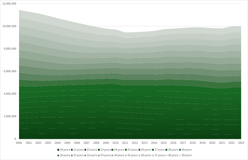
Now we can see both the total number of women aged 20-39, and their distribution among ages. This is a decent diagram (and we will reproduce it for the Scandinavian countries below) but note that because the ages are stacked, you have to take a closer look to spot the remarkable differences between the baby boomers and later cohorts.
Finally, we can also display cohorts, e.g., track the women who were 36 years old in 2000 until they left the 20-39 age window after four years (blue line at the very top):

This diagram is an excellent choice if you want to study population-level effects. For example, as a result of the 2011 census, population numbers had to be corrected downward. Since then, cohort sizes have been rising all the time, indicating immigration levels way above emigration and deaths.
Finally, the cohort diagram can be switched into a stacked area diagram as well:

The total number of women 20-39 comes in as additional information, but apart from that the diagram is not exactly a feast for the eyes.
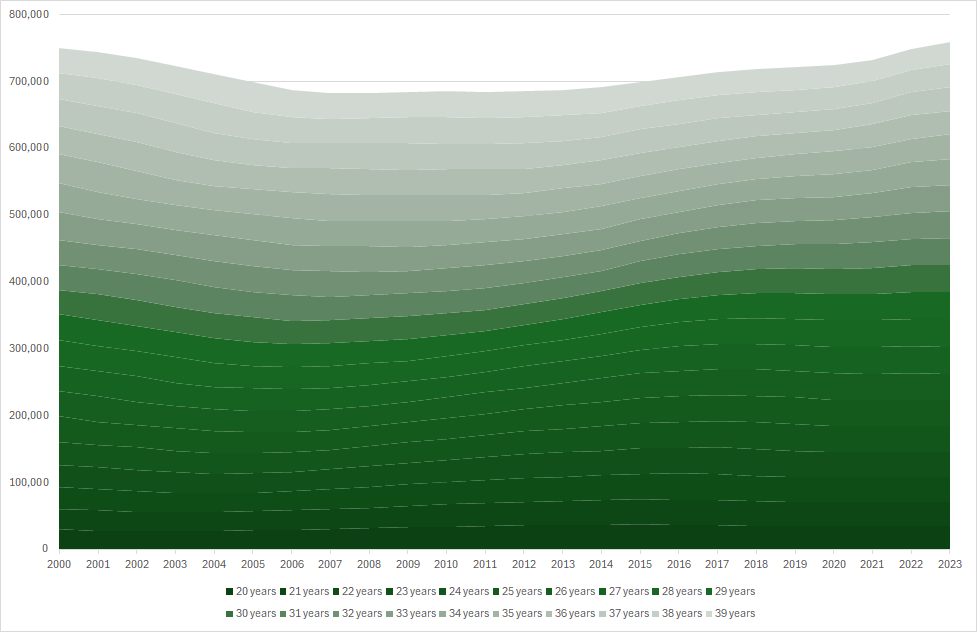
Enough with these experiments! We will stick to the stacked area chart with calendar years on the horizontal axis. Here comes Sweden:

And Norway:

And Finland:

And Denmark:
In all countries considered, the population (of women 20-39) has been increasing recently. Here’s a diagram including all five countries, with population in 2000 set to 100%:
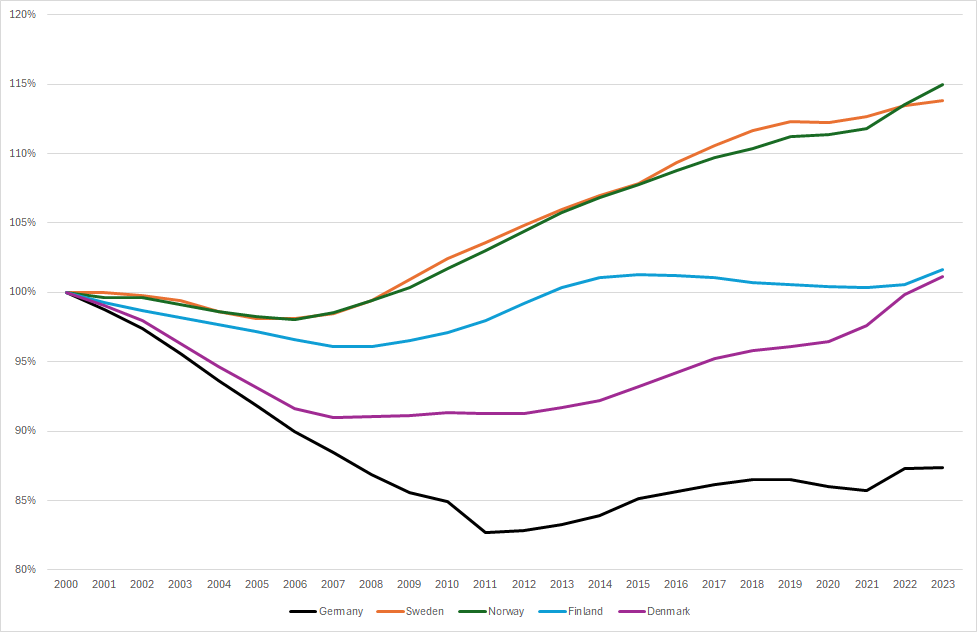
If there is an issue with birth rates, it is not due to decreasing number of women of child-bearing age.
Next up is age distribution. For example, for each calendar year and country we can compute the average age of all women in the 20-39 group:

Indeed, average age has been rising since around 2015 (a little later for Denmark) – but the trend looks quite continuous, and the effect on numbers of births should therefore be continuous as well.
But is it? Let’s start with the long-term view. These are numbers of births in the five countries since 1950 (left axis for Germany, right axis for the Scandinavians):

In all countries, 2021 exhibits the same uptick, followed by decline in 2022 and 2023.
Zooming in, these are numbers of births relative to those in the year 2000:

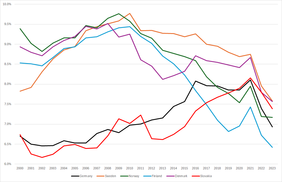
Now it is time to combine numbers of births and numbers of potential mothers, and compute birth rates. Note that there is not “the” birth rate. We will simply divide the number of births by the (year-end) number of women in the 20-39 age group. This is what we get:

For example, Germany was doing pretty well in terms of birth rates, and then 2022 and 2023 hit. The situation for Sweden and Denmark is similar, whereas for Norway and Finland the most interesting aspect seems to be the short-lived baby boom of 2021.
I will stop here for Scandinavia. For Germany, I took a closer look at birth rates by age of the mother:
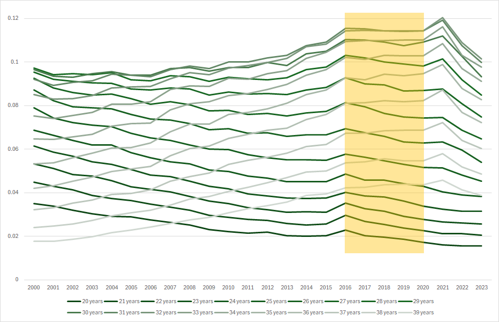
The period from 2016-2020 (yellow box) exhibits pretty stable linear trends for all ages (downward for younger women, upward for older women). Both the 2021 boom and the 2022-2023 bust seem to have affected those in the middle most. Here are the results of a 2016-2020 regression of births per age of mother compared to what actually happened in 2021-2023:

Summing over the ages gives 29,554 “excess births” for the 20-39 age group in 2021, followed by “birth deficits” of 31,925 in 2022, and 68,593 in 2023. Bujard’s and Andersson’s story might explain 2022, but neither 2021 nor 2023. And it is not even worth asking the MPIDR ladies.
Where does all this leave us? Birth rates in Germany and Scandinavia are on a downward trajectory. Short-term explanations that have been published so far are unsatisfying. Long-term grand narratives based on what people say are useless anyway. Digging into the data will help, but most data will be jealously guarded by the authorities.
My guess is that we need to have a closer look at the time dimension. For example, Ulf Lorré has produced nice diagrams for Germany and Sweden, contrasting births and vaccination activity. If he reads this, maybe he will do Norway, Finland and Denmark as well?
Update (1): These are birth rates by age of mother for Sweden:

The situation resembles the one in Germany, but the effects are more evenly distributed among the ages, cf. the 2021-2023 births against a 2016-2020 regression:

There are 3,566 “excess births” for the 20-39 age group in 2021, followed by “birth deficits” of 3,785 in 2022, and 5,191 in 2023.
Update (2): By popular request, I also looked at Slovakia. There, the population of women aged 20-39 is actually decreasing:

It is therefore surprising that Slovakia (red) has been doing relatively well regarding births (at least until 2021):

Of course, declining population in combination with stable numbers of births means increasing birth rates:
The effect of 2022 and 2023 is as bad as in Germany and in Scandinavia. Birth rates by age of mother can be displayed as well:

Mothers in Slovakia are a lot younger than in Germany and in Scandinavia. Finally, these are 2021-2023 births against a 2016-2020 regression:

There are 834 “excess births” for the 20-39 age group in 2021, followed by “birth deficits” of 2,136 in 2022, and 5,491 in 2023.
Wonderful, thank you! This is a well-founded refutation of the common narrative about dwindling women of childbearing age or older mothers. The latter in particular is also at least partially compensated for by artificial insemination. I had omitted to include age data because it was immediately clear that the decline in births began suddenly in 2022. It happened even faster than you can show in the annual data, namely within a quarter, as far as I can tell for Germany and Sweden.
Great work! As a swede, allow me to raise a few points about our data, which I'm sure insn't unique to us:
Abortion rates have remianed flat for ages, ca 30 000/year carried out. What this means is that even a slight dip in no. of pregnancies per year will have a greater impact, as abortion numbers remain the same, right? Is there a way to compensate or take this into account? My suspicion is, the drop-off in pregnancies -> births from pre- to post-injections is even greater than it looks to be thanks to abortions /not/ dropping in numbers.
The rates differ greatly between swedish women and non-european groups, in two significant ways: the swedish women have 2.1 children, later in life (think it's at age 30ish for the first, typically) and with a greater interval between each. Arab, afghan, negro women all have more than four children, often more than six, and at short intervals, also they have their first one at age 20 or so. Surely, this has some kind of impact on the data, apart from effecting slow genocide via migration and wombs? To get at such data however, you have to be an accredited researcher - data correlation to race/culture are collected, but are generally not made public, f.e. the data of the ethnic composition of prisoners is not made public, hasn't been for 20+ years now.
I'm sure you're aware of similar potential sources of small but cumulative errors, still all we can do is work with the data as known, so again I say good work!
(Apologies, for spelling, grammar, am in a hurry.)