


In May 2013, in a different world, #killallmen trended on Twitter. How’s the project going? Here’s a diagram showing proportions of male deaths among all deaths, by calendar week, for Germany:

Note that, since 7 * 52 = 364, from time to time there has to be a year with 53 calendar weeks. The year 2020 was one of these but I omitted week 53 from the diagram.
The grey area indicates the span (from minimum to maximum) for the years 2016-2019. The black line marks 49.34%, which represents the population share of men (in the years 2016-2021, the number has always been between 49.30% and 49.35%, cf. the table below).
Back in the day, early spring was flu season, with particularly bad ones in 2017 and 2018. Many very old and frail people died then. Since the population pyramid leans heavily to the women side at the top, during those periods the proportion of male deaths goes down. Nevertheless, men used to catch up later in the year, ending up with a proportion of male deaths (“m / deaths”) very close to the proportion of men in the population (“m / pop”):
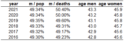
Something strange started in 2020 and accelerated in 2021. Is this due to the changing age distribution (e.g., the Boomer Bulge working its way up the pyramid)? Average age (“age men”, “age women”) looks inconspicuous. Am I being Simpsoned here? To an extent, yes, particularly regarding very old men. But proportions of male deaths in 2021, when stratified by age, still rank 1st among 2016-2021 for most age groups:

Oh, how I would like to live in a world where those in power actually cared about such matters. But what can you expect from people that are unable to define what a man is?
Or a woman.