

It’s filters all the way down
Judges 7:2

Imagine you are in a pandemic. The year is 2021, with lightning-fast computers and broadband internet to which everybody is connected. Your country is one of the richest in the world. You are the government institution responsible for monitoring the pandemic, for collecting data, and for advising politicians about reasonable responses. What do you do?
Wrong! No, you don’t try to setup your data queries so that you can be pretty sure to get reliable and complete information. No, you don’t set sensible incentives to the entities reporting to you (local health offices, hospitals, and such). No, goalposts are not fixed. After all, your country is Germany, and you are called the Robert Koch Institut (RKI), and the man is famous, and you are standing in a long tradition, and you are an authority.
So you just set up some preliminary data requests, people start sending in numbers, you design some reports, you think about the colors, somebody builds you a dashboard (now, isn’t that cool), from time to time you adapt the requests (Oh, age does play a role? Please send us data stratified by age now. Oh, there are vaccines now? Please send us data indicating vaccination status. Oh, the number and schedule of vaccinations makes a difference? That would make the interface too complicated. Don’t send more data, we will adapt our definitions.). Where do you end up?
Here:

This diagram shows, for overlapping four-week periods (calendar weeks of 2021),
the number of Covid cases recorded (blue),
of these the number of cases where you know if people had symptoms (dashed, grey),
of these the number of cases with symptoms (grey),
of these the number of cases from 12y up, and with known vaccination status (black),
and of these the number of cases fully vaccinated (red).
For example, for calendar weeks 45-48, you start with a whopping 1,409,969 cases. Of these, for 578,708 (less than half) you have information if symptoms were present. Of these, 510,022 had symptoms. Of these, 340,437 were 12 years old or older and you know the vaccination status (more precisely, you know that they are fully vaccinated or have never taken a “jab”, but there are no cases in one-jab limbo). Of these, 168,403 have been fully vaccinated.
You have filtered yourself into futility, and you have obviously been surprised by the virus. After all, up to around calendar week 42, you had a rather decent picture of the situation. But then your numbers went south. For calendar weeks 45-48, actually, the number of cases where you know about symptoms has decreased although you have replaced week 44 (with 177,772 cases) by week 48 (with 385,001 cases).
Do you care? No, you happily take the 168,403, you divide by the 340,437, you get 49.47% and then, based on some 12y-and-up-vaccination rate of around 70%, a quite reassuring vaccine effectiveness that you can report and so boost your booster campaign.
But, on a long, dark, rainy evening, maybe you start wondering if this is reasonable. What might be the actual proportion of fully vaccinated cases among all 12y-and-up cases? What about some lower and upper bounds? Ok, the numerator for the lower bound must be at least 168,403 (implying that despite all your filtering, you have identified all vaccinated cases). For the denominator you would have to exclude cases among children (0-11). Most of the time, they make up around 15% of cases, so to be safe you assume 10%. You end up at a lower bound of 168,403 / 1,409,969 / 0.9 = 13.27%. For an upper bound, you can only exclude the 340,437 – 168,403 unvaccinated, and the children. Better assume 20% of cases for them, and get 1 – (340,437 – 168,403) / 1,409,969 / 0.8 = 84.75%. Proceeding in this way for all data points, you get this diagram:
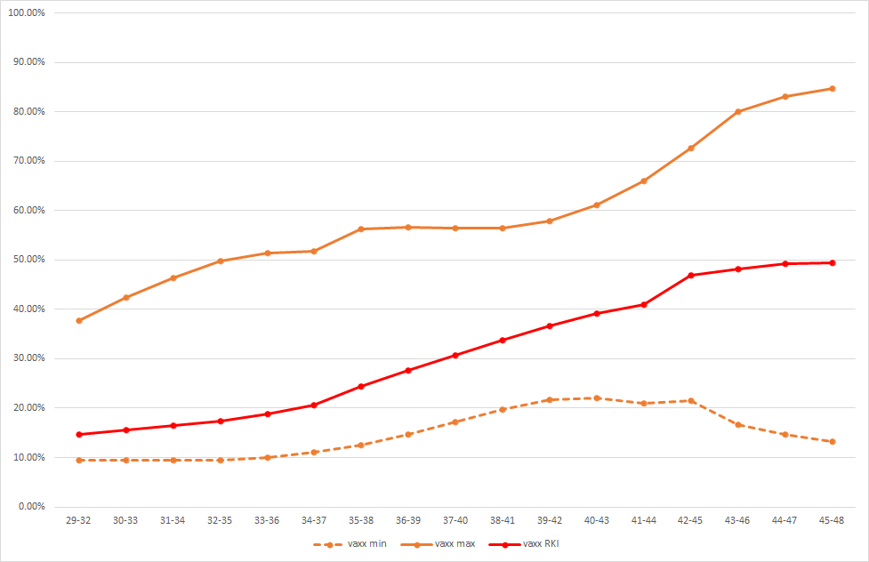
First of all, the naïve proportion (vaxx RKI, red) only knows one direction, and that is up. In parallel with your losing grip on the data, the trend seems to have stopped but can you be so sure? At the same time, your lower and upper bounds have been going separate ways.
Damn! Maybe this is due to “symptomatic case” being too lax a category. Let’s take “with hospitalization” on top, as an additional filter. After all, counting beds can’t be that difficult, can it?
Well, it can:
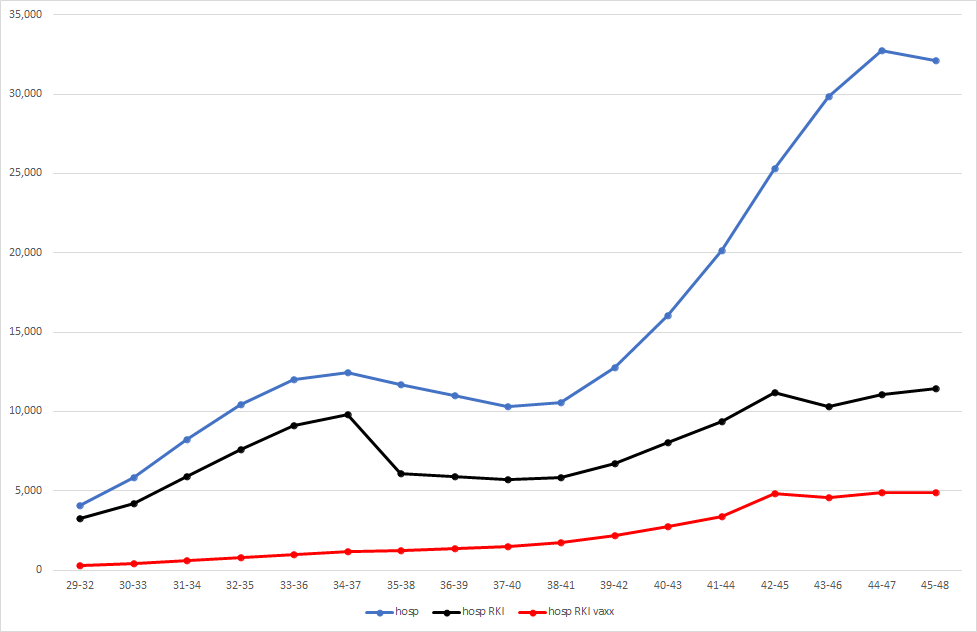
This diagram shows known hospitalizations (hosp, blue), hospitalizations with known symptom status and symptoms and 12-and-up and known vaccination status (black), and of these the fully vaccinated (hosp RKI vaxx, red). Again, somewhere around week 42 you have lost your grip on reality, and whatever you recorded since then can only be described as suspicious.
It doesn’t get better (actually, it gets worse) if you play the game by further restricting to ICU:
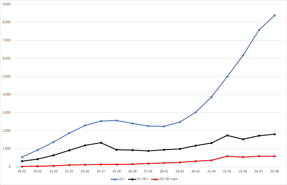
What are you doing here? Is this your idea of a basis for decision about a vaccine mandate?
Today (Dec 14th, 2021), it was announced that from now on hospitals will be required to submit the vaccination status of ICU Covid cases. Better late than never?
You like to let the numbers imply the arguments but that makes me wonder if I'm picking up the right subtext. I need to read slower.
Here in the US, I have concerns about our institutions and of regulatory capture that can sound paranoid. I like to think that other countries aren't as compromised and so can act as a sanity check. The impression I'm getting from this is that things aren't quite adding up for Germany either.