

Netherlands vs North Rhine-Westphalia
Psalm 107:23

We are beyond the point where much insight might be gained from the study of country-level Covid data. I consider comparison to be more illuminating. I will illustrate this claim by comparing the Netherlands (NL) to the German state of North Rhine-Westphalia (NRW). AI, please paint me a nice image of a “dutch windmill near Cologne cathedral”.

Nice evening mood! And all the towers are there… what? Please try again.

One, two, … that’s better. Oh no, now you messed with the vanes! One last try…

OK; I’ll give up. Nice extension to the cathedral, must be the German attempt to get to net zero. Back to business.
Why NRW and not all of Germany? Because NL and NRW are of comparable size, have comparable population (around 18 million each), therefore comparable population density, comparable GDP and other economic and social indicators, and because they share a border of almost 400km length. Viruses are unimpressed by border controls, so whatever difference can be observed regarding Covid data is likely to be the result of policy decisions. Of course, comparison can only detect instances of one policy doing better than the other. If both policies are equally bad, the results will be equally bad as well.
But is it just policy? At least the age distributions of the populations should be taken into account. NRW is much older on average than NL. The following diagram displays, for each age, the difference between the number of people of that age in NRW and in NL in the year 2022, stratified by sex (note that the 76-year olds are those born during the final phase of WW2):

This difference in the age pyramids will be reflected in mortality statistics. Here they are, total number of deaths as well as official Covid deaths, for all calendar weeks in 2020-2022 (I had to tinker a bit with week(s) 53 for the Netherlands; don’t worry):

Indeed, the total number of deaths in NRW usually amounts to around 1.4 times the total number of deaths in NL (green line, right axis). The diagram also shows the proportions of Covid deaths among all deaths (left axis):

Strange things were going on during Covid. What went wrong in NL in early 2020, and why did Covid deaths not decline in NRW in 2022?
I will now make the bold assumption that the lower number of deaths in a particular week is due to the better policy at that time. In order to correct for small seasonal effect, I shifted the NRW data for small numbers of weeks. The highest correlation between Covid deaths (60%) is obtained for a two-week lag (NRW two weeks behind). I don’t know why that should be so, and I would have expected the opposite (within Germany, infection waves seem to like to travel from South-East to North-West, and not from West to East).
However, assuming this two-week lag and a factor of 1.4 for the difference in age structure, I computed hypothetical “optimal” numbers of Covid deaths for each country (dashed lines):

The corresponding cumulative diagram may be easier to the eye:
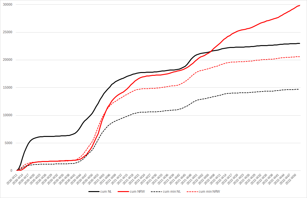
In both countries, around one third of Covid deaths may have been unnecessary (of course, they are all unnecessary; I am looking at you, gain-of-function maniacs). The reasons for the unnecessary deaths, however, might be different. Maybe NL made similar mistakes as Italy and Sweden in 2020, sending sick people back from hospitals into care homes. Maybe NRW completely lost the plot in 2022, not distinguishing anymore between deaths “of” and deaths “with” Covid.
One last point: the correlation between total numbers of deaths is actually higher, around 72%, and it is highest without assumption of a time lag.
AI, say “goodbye to Netherlands and North Rhine-Westphalia”.

Thank you very much!
Excellent work!
Some suggestions.
I am not at all surprised by the Dutch lines.
The Dutch were very liberal concerning euthanasia already before 2020, hence, they had far less objections against implementing "end of life care" with midazolam + morphine (MiMo, or generally speaking with benzos + opioids) in April 2020. Following WHO suggestions (that were taken from the scene soon later).
Then both countries employed these rules end of 2020. Hence, I would explain most of the differences later on with a dry tinder effect in NL.
Obviously, NRW had been hit far harder end of 2022. If do not have a reasonably idea for this. I would discard flu and C19 as very unlikely. But even the fax campaign does not appear to a stringent argument.
Finally, may I suggest doing a similar comparison with Belgium, meaning NRW to Belgium. I speculate: It will look even more extreme in April 2020.
Hi cm, that's another pretty interesting gimmick. Thanks for that.
I'm a little surprised to see Oranje in black lines. :-)
The time difference could be stochastic. I remember from much earlier years that the area records of the RKI surveillance of acute respiratory diseases often looked like bubbles in a saucepan. You don't actually see waves that cross the whole country. Here's an example: https://influenza.rki.de/Maps/2018_2019/2018_2019.gif