
The doctor’s tabloid


Why have so many doctors towed the Covid party line? In part, this is because certain channels, although mostly unknown to the public, are dominating the communication. For example, Deutsches Ärzteblatt is the one publication to be found on the desk of almost every physician in Germany, from aspiring anesthetist to uninhibited urologist. Read it, and know which way the wind is blowing.
A recent note on “the changing symptom profile of COVID-19 during the pandemic”1 caught my eye, and may illustrate typical issues2. All six authors are working for the Robert-Koch Institut (RKI), the government-adjacent agency responsible for most of pandemic management in Germany. Support by the Bundesministerium für Gesundheit (ministry of health) is acknowledged in the paper.
The note is milking the data cow brought up by the RKI during the pandemic for the development over time of the distribution of various Covid symptoms, notably cough (Husten), cold (Schnupfen), fever (Fieber), sore throat (Halsschmerzen), and loss of taste (Geschmacksverlust). We are given the following table:
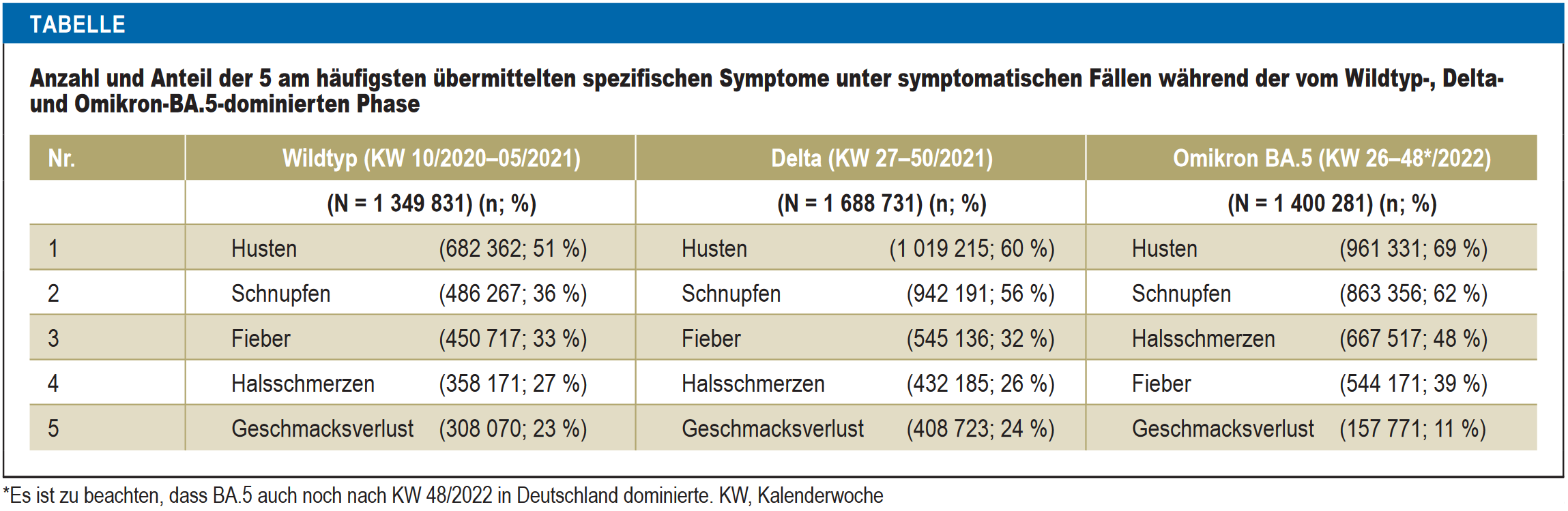
Three waves (“wild”, delta, and omicron BA.5) are presented synoptically. For example, during the delta wave, from calendar week 27 to 50 of 2021, a sum total of 1,688,731 cases have been considered, of which 1,019,215, or 60%, had presented with cough. At first sight, the numbers are looking quite impressive, and although the ranking of symptoms has changed, omicron BA.5 seems to be the worst of variants (more cough, cold, fever, and sore throat; only loss of taste has become rarer). However, what is almost completely missing is context.
The total numbers of cases considered (N) are the result of the application of three consecutive filters. Consulting additional RKI data, the following table shows the total number of cases officially recorded during the respective waves (total), the number of cases for which information about symptoms is available (info), the number of cases for which information about symptoms is available and symptoms have been present (symptoms), and the number considered in the paper (final), which has been constructed from the previous one by exclusion of those cases where the only symptoms present were “general”.
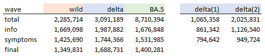
Apparently, the problematic step is from “total” to “info”. From a certain point in time, the RKI has been getting much less information about the presence of symptoms. This point of time may be located during the delta wave. To illustrate, the delta(1) and delta(2) columns split the delta wave in two, until and after calendar week 44 of 2021. The second subperiod has almost two thirds of cases but the percentage with information about symptoms goes down from 80% to 55% (which is still much more than the 19% during the BA.5 wave, and we haven’t even mentioned underreporting).
It is not at all obvious if BA.5 is better or worse, in terms of the symptoms on display, than the previous waves. The only diagram from the paper indicates that there are further issues:
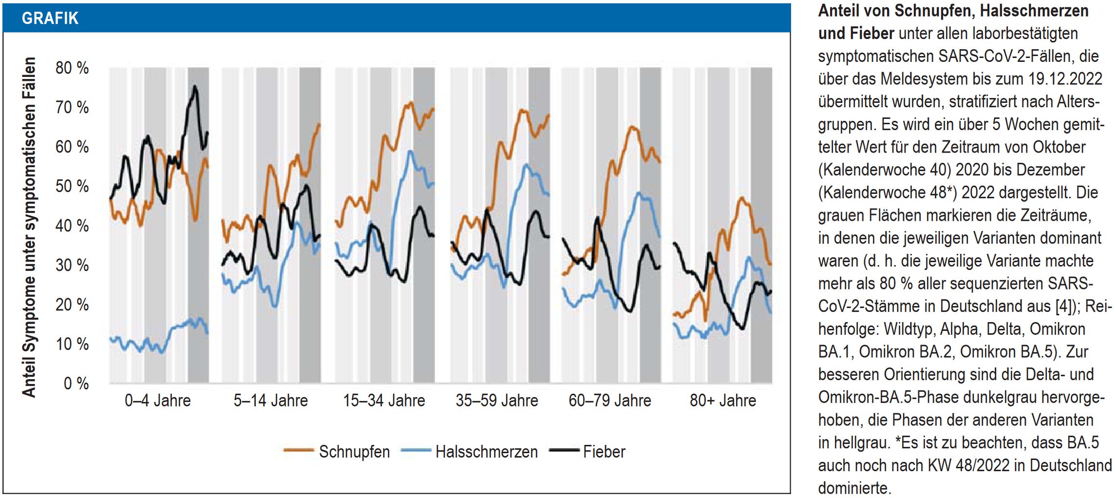
On display are percentages through time for the three symptoms cold (orange), sore throat (blue), and fever (black), stratified by age group. The delta and BA.5 waves are on darker grey background. Unfortunately, the resolution is quite low. Nevertheless, I recycled and updated a diagram from a previous post of mine, and put it on top of the above figure for the 60-79 age group:
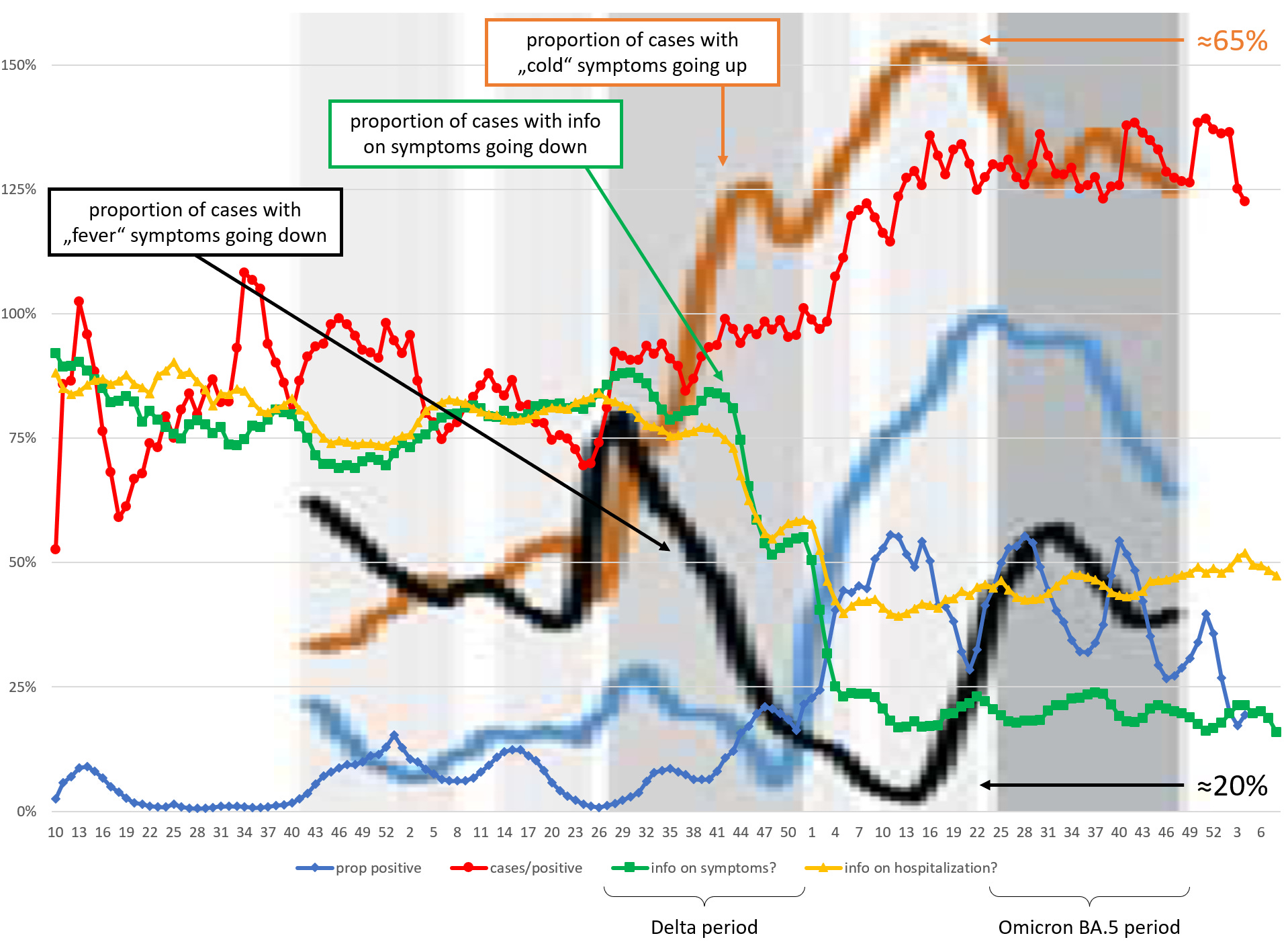
Yes, that is one horrible diagram. Note that the scales are different (the symptom curves are stretching between around 20% and 65%). The problem of reduction in information about symptoms discussed above is visible in the green curve. Curiously, this decline is accompanied by decline of cases with fever, and increase of cases with cold.
I don’t know what to make of all of this, but a few general remarks may be appropriate:
Governments and adjacent agencies are sitting on tons of data that we the great unwashed do not get to see (for example, it was news to me that the RKI has a list of, and data on, 14 specific symptoms)
They will publish evaluations of these data when it suits their purpose (for example, when publication profiles need some pushing, or when the narrative is to be adapted)
The sheer abundance of data is no guarantee for usefulness of the evaluations
Anyway, the conclusion drawn in the paper is thus: with BA.5, the symptom profile of Covid has become more “influenza-like”, and GPs should test for both Covid and influenza, in order to timely apply “specific antiviral therapy”. To the authors, it remains an open question if the changing symptom profile of Covid is due to the changing virus, increasing levels of immunity in the population, or both.
To me, however, the data are also consistent with a more-or-less constant symptom profile. My bet is on seasonal effects and interference with other infections.
According to the publisher: For technical reasons, the English full text will be published approximately two weeks after the German print edition has been published.