
Who's first in line?

Inspired by Christof Kuhbandner’s analysis of excess mortality in Germany, I have been trying to replicate something he visualizes in fig. 3 of the pdf: an effect seems to predate its cause. It turns out that, to achieve this aim, we can stay in the world of Gompertz functions.
As in this previous post, assume that some vaccine is being forced onto a population. Vaccine uptake is described by the Gompertz function f(t) = a · exp(b · exp(c · t))) with a = 0.2, b = -1, c = -1.0.
This time, there is no virus around but the vaccine is a killer. It slays some proportion h(t – d) of the vaccinated, and h(t) follows a mirrored Gompertz function:
h(t) = A – A · exp(B · exp(C · t)))
Forgive me for using (for lack of a better idea) the same letters A, B, C as in the previous post. Cheerfully, we set A = 50% (initial vaccine mortality of 50%), B = -1 (why not?), C = -0.5 (mortality rate declines quickly; bad luck for those first in line), and d = -15 (after having played around a bit). Here’s the two functions in action (with f(t) in blue as in the previous post):

Now let’s compare daily vaccine uptake to daily vaccine-caused deaths. The former is represented by the first derivative f'(t) of f(t), the latter by f'(t) · h(t – d). We get this diagram (where I multiplied f'(t) · h(t – d) by 10 to align the scales):
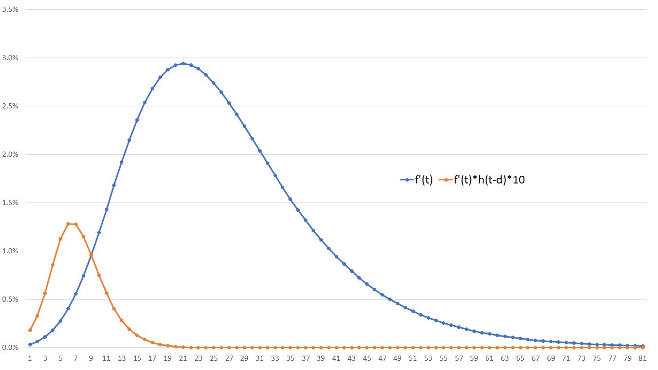
All the deaths are being caused by the vaccine, and yet, due to the quickly declining mortality rate, the peak in deaths precedes the peak in vaccinations. Of course, all of this does not have to inform us about reality, but it is a fascinating bit of (very simple) mathematical modelling anyway.
Thanks for posting the nice visuals. They helped me realize a key problem in the arguments going back and forth: nobody is correcting the vaccine-associated Gompertz function with the demographic weights of those being vaccinated at any one moment, which shift dramatically over time. They are front-loaded, and I am certain that correcting for that weight will show the mortality curve begin to trail the vaccination curve.
I will do that work once I'm no longer tied to the DMED investigation.
Is it correct to say this is a hypothetical example of Simpson's paradox: i.e. getting the opposite result (in this case the opposite order of the curves) as one would expect, owing to overaggregation (in this case of age)?